Overview
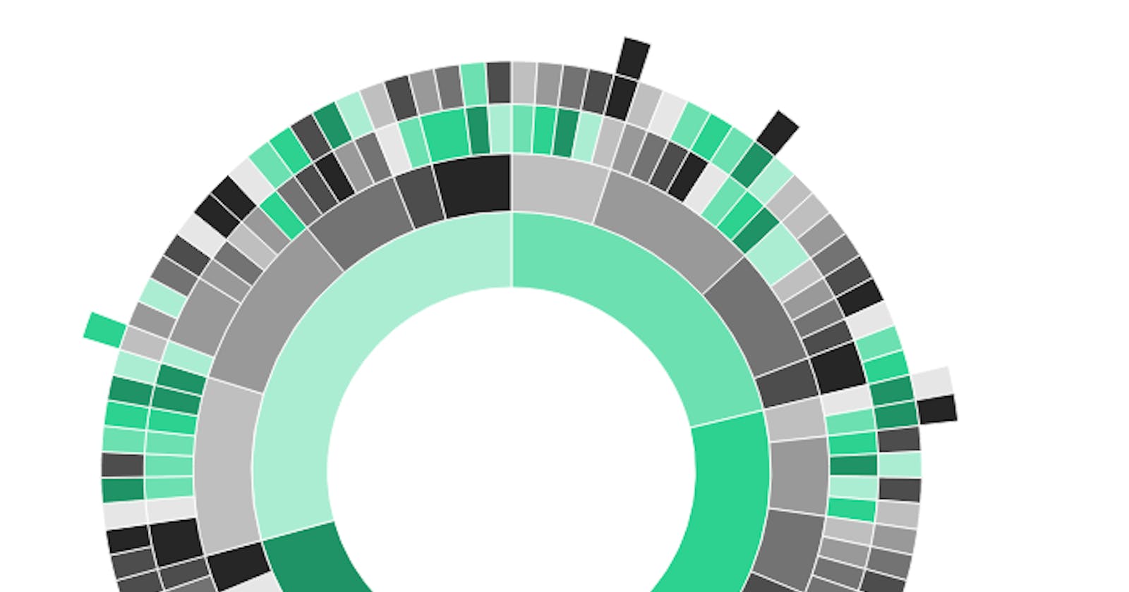
This is a quick walk through of using the sunburstR package to create sunburst plots in R. The original document is written in RMarkdown, which is an interactive version of markdown.
The following code can be run in RMarkdown or an R script. For interactive visuals, you'll want to use RMarkdown.
Load Libraries
The two main libraries are tidyverse (mostly dplyr so you can just load that if you want) and sunburstR. There are other packages for sunburst plots including: plotly and ggsunburst (of ggplot), but we'll explore sunburstR in this post.
library(tidyverse)
library(sunburstR)
Load Data & Explore
The data is from week 50 of TidyTuesday, exploring the BBC's top 100 influential women of 2020.
The head() function presents the first six rows in a dataframe.
women <- read_csv('https://raw.githubusercontent.com/rfordatascience/tidytuesday/master/data/2020/2020-12-08/women.csv')

head(women)
Add Continents
The original dataset organized 100 women by category, country, role and description. I found that for employing the sunburst plot, I would want to group countries together by continents.
I manually added country names to continent vectors, then added a new column to the women dataframe to conditionally add continent name.
We could then focus on six continents rather than 65 separate countries.
# add continent as character vector
asia <-  c('Afghanistan', 'Bangladesh', 'China', 'Exiled Uighur from Ghulja (in Chinese, Yining)', 'Hong Kong', 'India', 'Indonesia', 'Iran', 'Iraq/UK', 'Japan', 'Kyrgyzstan', 'Lebanon', 'Malaysia', 'Myanmar', 'Nepal', 'Pakistan', 'Singapore', 'South Korea', 'Syria', 'Thailand', 'UAE', 'Vietnam', 'Yemen')

south_america <- c('Argentina', 'Brazil', 'Colombia', 'Ecuador', 'Peru', 'Venezuela')
oceania <- c('Australia')
europe <- c('Belarus', 'Finland', 'France', 'Germany', 'Italy', 'Netherlands', 'Northern Ireland', 'Norway', 'Republic of Ireland', 'Russia', 'Turkey', 'UK', 'Ukraine', 'Wales, UK')
africa <- c('Benin', 'DR Congo', 'Egypt', 'Ethiopia', 'Kenya', 'Morocco', 'Mozambique', 'Nigeria', 'Sierra Leone', 'Somalia', 'Somaliland', 'South Africa', 'Tanzania', 'Uganda', 'Zambia', 'Zimbabwe')
north_america <- c('El Salvador', 'Jamaica', 'Mexico', 'US')

# add new column for continent
women <- women %>%
    mutate(continent = NA)

# add continents to women dataframe
women$continent <- ifelse(women$country %in% asia, 'Asia', women$continent)
women$continent <- ifelse(women$country %in% south_america, 'South America', women$continent)
women$continent <- ifelse(women$country %in% oceania, 'Oceania', women$continent)
women$continent <- ifelse(women$country %in% europe, 'Europe', women$continent)
women$continent <- ifelse(women$country %in% africa, 'Africa', women$continent)
women$continent <- ifelse(women$country %in% north_america, 'North America', women$continent)

women
Data Wrangling
The key to using the sunburstR package with this specific dataset is the wrangling that happens to filter by continents we created above. We'll also want to get rid of dashes with mutate_at as dashes are structurally needed to render the sunburst plots.
Below, I've filtered the women data frame into Africa and Asia (the same could be done for North and South America and Europe as well).
The two most important operations here are the creation of the path and V2 columns that will later be parameters for rendering the sunburst plots.
# Filter for Africa
africa_name <- women %>%
    select(continent, category, role, name) %>%
    # remove dash within dplyr pipe
    mutate_at(vars(3, 4), funs(gsub("-", "", .))) %>%
    filter(continent=='Africa') %>%
    mutate(
        path = paste(continent, category, role, name, sep = "-")
    ) %>%
    slice(2:100) %>%
    mutate(
        V2 = 1
    )

# Filter for Asia
asia_name <- women %>%
    select(continent, category, role, name) %>%
    # remove dash within dplyr pipe
    mutate_at(vars(3, 4), funs(gsub("-", "", .))) %>%
    filter(continent=='Asia') %>%
    mutate(
        path = paste(continent, category, role, name, sep = "-")
    ) %>%
    slice(2:100) %>%
    mutate(
        V2 = 1
    )
Sunburst: Africa
Ultimately, I found the information best presented by continent as the base of the sunburst plot, followed by category, specific roles and the names of each of the 100 women honored by the BBC.
Moreover, by presenting the data by continent, you can focus on just five specific color as you decide on a palette.
I wouldn't recommend trying to pick a color for each role or name; it becomes too unweildy. Just pick five colors for the two inner most rings of the sunburst plot and it'll shuffle the rest of the colors.
# Africa
sunburst(data = data.frame(xtabs(V2~path, africa_name)), legend = FALSE,
         colors = c("D99527", "6F7239", "CE4B3C", "C8AC70", "018A9D"))

Sunburst: Asia
# Asia
sunburst(data = data.frame(xtabs(V2~path, asia_name)), legend = FALSE,
         colors = c("#e6e0ae", "#dfbc5e", "#ee6146", "#d73c37", "#b51f09"))

Here's what the plot would look like on RMarkdown as you hover over it:

And that's it for visualizing the BBC's top 100 influential women in 2020 with the sunburstR package.
For more content on data science, visualization, in R and Python, find me on Twitter.
